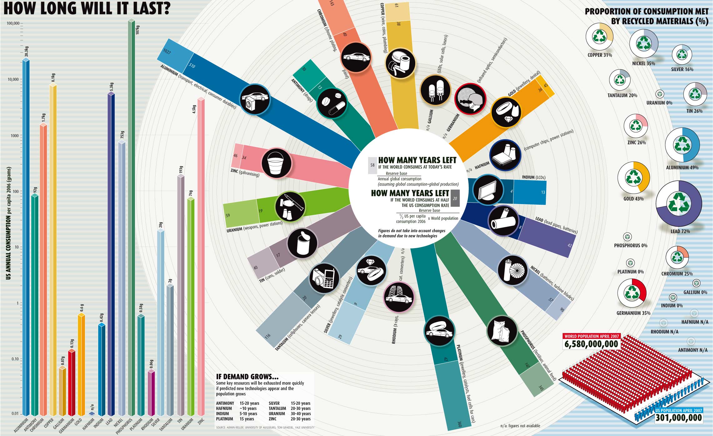
It's not often I see a graphic that does a good job communicating something, anything. I spend a lot of time looking at graphics in presentations that either try to communicate too much, or not enough, or nothing at all. This one really is exceptional. Great use of color, white space, image size, etc to tell many components of a story laddering into a larger point. Edward Tufte would be proud.
(Graphic from The Global Sociology Blog. For full size, Click Here

(Graphic from The Global Sociology Blog. For full size, Click Here

Comments